Qt Designer's New Features
–Ь–∞—В–µ—А–Є–∞–ї –Є–Ј Wiki.crossplatform.ru
__NOTOC__ by Jarek Kobus
The upcoming release of Qt 4.4 brings a multitude of new features and enhancements to the Qt libraries, but the developers of the venerable Qt Designer have also been busy. This tool for designing and building graphical user interface components has also been updated and improved in a number of areas. In this article, we'll take a brief tour of the new features and improvements you will find in Qt Designer 4.4.
- Improved Property Editor
- New Resource Handling
- Enhanced Icon Editing
- Improved Style Sheet Editor
- New Widgets and Layout Features
- Other New Features
- What's Next for Qt Designer?
As the core Qt developers work on new modules, like QtWebKit, and create new widgets, it's up to the team working on Qt's tools to integrate support for them into Qt Designer. Sometimes, new features lead to new requirements for Qt Designer, like support for embedded user interfaces. However, many improvements are designed to make existing tasks easier, like better resource file handling, or enhanced support for widget style sheets.
–°–Њ–і–µ—А–ґ–∞–љ–Є–µ |
Improved Property Editor
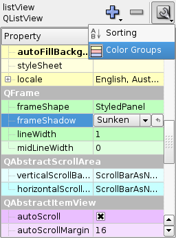
One of the first changes regular users of Qt Designer will notice is the new-style Property Editor with its own toolbar. The property editor now shows the name and class name of the currently selected widget, and the toolbar provides actions for adding and removing dynamic properties. A drop-down menu is used to configure the property editor itself; for instance, you can now sort properties alphabetically and enable group coloring, as shown below.
Some property types have new editors. For example, the bool type now has a check box instead of a combo box. For expandable properties, the property editor now remembers the open/closed state, even across sessions.
New Resource Handling
Qt Designer 4.4 incorporates a new approach to using the Qt Resource System. Instead of being limited to using a shared, global set of resources for all forms, designers can give each form its own set of resources. When a form is active, its resources are accessible from the Resource Browser dock window and from any Select Resource dialogs related to properties of widgets on the form.
The old Resource Editor dock window and the old Find Icon dialog have been replaced by a new Resource Browser dock window and a new Select Resource dialog. Both of these let the user browse the contents of all the Qt resource (.qrc) files that have been loaded for the current form.
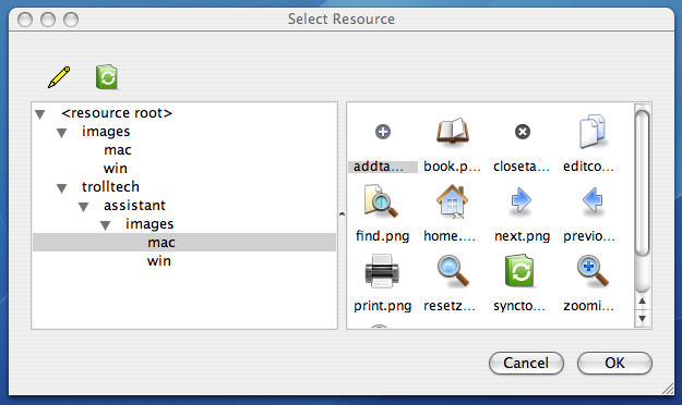
The Select Resource dialog is accessed via the Property Editor and is used to choose images to use for a widget's icon property, or one of its child properties (see below for more about this). The dialog shows a tree view of the paths to the current form's resources alongside an icon view that only shows the resources on the selected path, making it easier to narrow searches to the most relevant icons.
Like the Select Resource dialog, the Resource Browser dock window shows the same set of resources, but serves a different purpose. For example, it can be used to choose icons for actions---icons can be dragged from the Resource Browser and dropped onto actions in the Action Editor dock window.
Developers who have to work with resource files in more than one tool will appreciate the reload feature of the Resource Browser and Select Resource dialog. This is used to reload the current form's resource files and pixmaps whenever they have been changed outside of Designer.
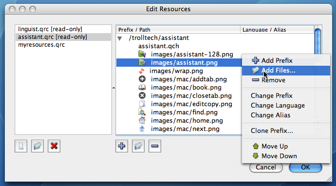
The Edit Resources dialog, accessible from both the Resource Browser and the Select Resource dialog, has also been improved to allow proper management of the files used for each form.
The dialog shows the list of resource files loaded for the current form alongside a tree view which displays the contents of the currently selected resource file. In addition to the usual editing facilities, context menus are used to provide access to advanced features.
Enhanced Icon Editing
The way icon properties are handled by the property editor has been revised to allow designers to extensively customize the icons used by applications.
Each icon property shown can be expanded to show a list of child properties, which can be set or reset individually. Since there are four modes of icon display (Normal, Disabled, Active, and Selected) with an On and an Off state for each mode, there are potentially a total of eight different images for each icon.
Designers who are happy with Qt's automatic handling of icon states can continue to use just one image per icon; Qt Designer will use it to compute variations for all eight mode/state combinations.
The above image shows a set of images to be used for different states of an icon. Whereas the Active, Selected and Normal images have been generated from the original zoomin.png image, other images have been specially selected by the user.
The property editor's mechanism for selecting images has been slightly enhanced and now provides a menu to let the user choose between images obtained from resource files and image files on the file system. Since Designer remembers where each image came from, changing the image used for a particular state is just a matter of clicking the "..." button alongside each image in the property editor.
Because each element in a List Widget, Tree Widget, or Table Widget can have a different icon for each of the eight mode/state combinations, the editor dialogs for each of these widgets have been updated with a new, improved icon selector.
Improved Style Sheet Editor
Graphic designers familiar with Qt's widget style sheets can expect some extra help in the form of an improved style sheet editor.
Four new buttons have been added to the Edit Style Sheet dialog to help with customizing the appearance of widgets. Clicking a button opens the appropriate dialog for choosing images, gradients, fonts and colors. The Add Resource, Add Gradient and Add Color dialogs also have drop-down menus that list the properties they can set. Once selected, the appropriate code is inserted into the style sheet.
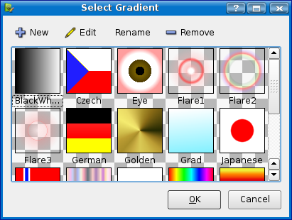
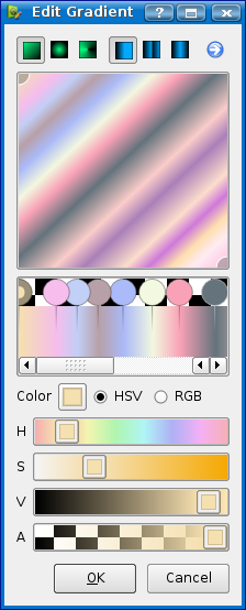
Two new dialogs have been added to make it easier to visualize, use and edit the gradient fills used in style sheets. In the Edit Style Sheet dialog, pressing Add Gradient causes the first of these new dialogs, Select Gradient, to be shown.
The Select Gradient dialog lets you select one of the predefined gradients which you can apply straight away, modify first with Edit, or use to derive a new gradient.
The Edit Gradient dialog lets you modify elements of the selected gradient, including type, spread, and color, and all the parameters specific to each element. For precise setting of parameters, the gradient editor can be expanded on the right to show editable numeric fields. Finished gradients are shown in the Select Gradient dialog for later use.
Since designers can build complex style sheets using the style sheet editor, a handy indicator is included in the lower-left corner of the dialog to provide instant feedback on the validity of each style sheet.
New Widgets and Layout Features
New widgets have been added to the Widget Box: Command Link Button has been added to the Buttons, Mdi Area and Scroll Area to the Containers, Plain Text Editor to the Input Widgets, and QWebView to the Display Widgets section.
The New Form dialog now contains templates for forms based on individual Qt widgets, such as QFrame and QTabWidget; templates for third party widgets provided via plugins are also available. These are found in the Widgets and Custom Widgets sections of the dialog.
A new layout, the Form Layout, is also provided. This is used for creating the typical two-column "descriptive label and control" layout used in many dialogs. QFormLayout handles widget alignment correctly on all platforms. Since its .ui file syntax is equivalent to a two-column QGridLayout, forms that use a QGridLayout to achieve a form-like layout can be migrated conveniently by replacing the class name in the .ui file.
Fine-tuning the effects of layouts is made easier by the Size Constraints context menu, available for widgets when Designer is in Edit Widgets mode. The menu's actions apply constraints to the height, width, or size of the selected widget. These constraints inform layouts about the amount of space each widget needs in those situations where some widgets require special treatment.
In Edit Widgets mode, you can now drag widgets out of existing layouts. It is still possible to move an entire layout by dragging one of its widgets when necessary, but this behavior needs to be activated with modifier keys.
Other New Features
There are plenty of other less-prominent features that make Designer easier to use. Here are just a few of them:
- Object names can now be edited in the Object Inspector window by double clicking on the object name.
- It is now possible to print a form, and to preview the code generated by uic.
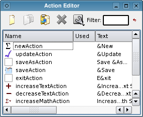
- The Action Editor dock window now has its own toolbar with buttons that enable copying and pasting of actions between forms. As with many file browsers, the dialog now lets designers switch between detailed and icon view modes for displaying the available actions.
- Developers who use promoted widgets extensively will appreciate the newly-added support for defining custom signals and slots. These can be added in the Promoted Widgets dialog or via the form's context menu.
The usability of the Edit Signals/Slots, Edit Buddies and Edit Tab Order modes have all been improved:
- Context menus have been added to the Edit Signals/Slots and Edit Buddies modes that provide options for selecting and deleting connections between widgets.
- The Edit Buddies mode menu also offers a Set automatically action, which uses heuristics to attach buddies automatically.
- In Edit Tab Order mode, designers can access the purpose-built Tab Order List dialog to edit the tab order, making the task of setting tabs much more enjoyable than before.
Designer now provides more options for configuration and customization:
- It is now possible to customize Designer's toolbars. You can create your own toolbars or modify the existing ones.
- You can simulate the effect of setting a style sheet for the whole application, both for previews and for printing.
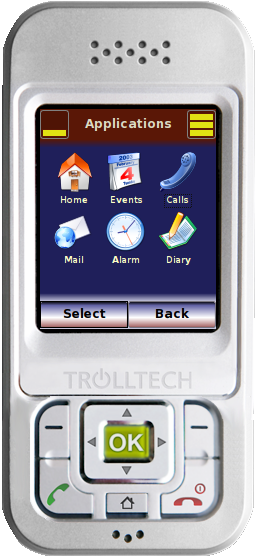
- As a convenience for developers designing user interfaces for embedded devices, forms can now be previewed with skins. These can be set along with the other preferences. A selection of skins are included with Designer.
Designer now uses the property editor code that is supplied with the Property Browser solution, demonstrating its use in one of the most demanding applications made with Qt.
What's Next for Qt Designer?
Although the Qt 4.4 series of releases will take into account feedback from users, we also plan to gradually introduce improvements that will improve the Qt Designer experience for developers on Windows CE and other embedded platforms.
