Adaptive Coloring for Syntax Highlighting
–Ь–∞—В–µ—А–Є–∞–ї –Є–Ј Wiki.crossplatform.ru

| 
|
| Qt Quarterly | –Т—Л–њ—Г—Б–Ї 26 | –Ф–Њ–Ї—Г–Љ–µ–љ—В–∞—Ж–Є—П | |
__NOTOC__
–°–Њ–і–µ—А–ґ–∞–љ–Є–µ |
[–њ—А–∞–≤–Є—В—М] Adaptive Coloring for Syntax Highlighting
by Helder CorreiaA feature present in many textual applications is the use of syntaxcoloring and highlighting. From source code editors to expression parsers andmathematics software, all kinds of software offer the possibility to assigndifferent colors to different classes of terms. In this article, we'll take thecoloring convenience one step further: let's make the machine choose the colorsfor us.
The problem with traditional manual color choosing is that once the userdecides to change the system color scheme (including the base color for textinput widgets), it will probably ruin the visibility of the syntax highlighting.The traditional solution is to change the previously chosen syntax highlightingcolor scheme in a tedious manual process. This then needs to be repeated eachtime the user gets bored with the system colors.
[–њ—А–∞–≤–Є—В—М] A Modern Approach
Computers were invented to help us, solve our problems, make our lives easierand do the dirty jobs for us. And all of this in an automatic way. So whyshould the user still need to bother to make sure that all applicationsfeaturing syntax highlighting really adapt well to a new system color scheme?And why should developers need to bother about all the different default colorschemes across the multiple desktop and mobile platforms where theirproducts need to be deployed?
Life can be so much easier and more productive if you can allow yourself theluxury (according to today's standards) of ignoring all this and let softwareadapt itself. In an ideal world, software should be able to morph completelycolor-wise. For instance, icons with massive usage of blue should turn red,yellow, white or something else when faced with an unexpected blue background.But that's a topic for a future article—let's focus on this one.
[–њ—А–∞–≤–Є—В—М] The Proof of Concept Solution
The algorithm proposed in this article is far from being perfect and assumessome user decisions that may not happen all the time, such as choosinghighly-contrasting foreground and background colors. Although our main goal isto raise awareness of this topic, the technical results are themselves verysatisfactory. So much so, that the code used here is in already in production,serving an existing open source project with no user dissatisfaction so far.
The simplicity and size of the algorithm may sound ridiculous to someone whois unfamiliar with color theory, but Qt makes things easier for us withits great color facilities. There are essentially three input factors:
- the background color (think of the QLineEdit or QTextEditbackground);
- the foreground color (think of the text the user inserts on the samewidgets above)—in the particular case of syntax highlighting, we're talkingabout non-reserved terms, for instance;
- the number of colors to generate (for example, equivalent to the numberof reserved terms to be highlighted).
The output will simply be a list of generated colors. Not only will this listomit both the background and foreground colors, but it will also offer areasonable contrast against them.
70% of the solution was achieved with a simple color rotation. The HSV colormodel was the natural choice to attack the problem with, since it provides avery easy method to play with color contrast and, fortunately, it is readilyavailable in Qt.
[–њ—А–∞–≤–Є—В—М] The HSV Color Space
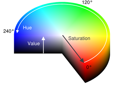
The Hue Saturation Value color space is just a convenient representation ofpoints in the familiar RGB color space that allows fast perceptual colorrelationships. It is usually interpreted as a cylinder, using the standardcylindrical coordinates to represent each component.
The hue component defines the base color and its value range is 0 to 359(degrees of arc, in this representation).In Qt, a hue of 360 has exactly the same meaning as 0, while 361 is equivalentto 1, and so on. Monochromatic (grayscale) colors have a hue of -1.
Next comes saturation, which defines the intensity of the color chosen,represented as a radial component in the above diagram. Its value variesfrom 0 to 255.
Finally, the value parameter sets the brightness of the color, and isrepresented as a vertical component along the axis of the cylinder in the abovediagram. The value must again be in the range of 0 to 255.
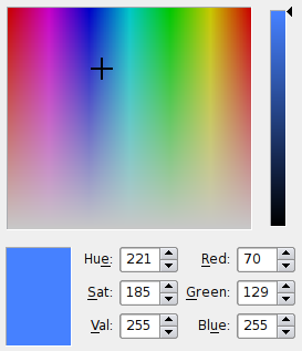
Another representation of the HSV color space that may be familiar to usersis the one used provided by QColorDialog. The hue parameter is measuredalong the x-axis in the color gradient box and the saturation parameter ismeasured along the y-axis.
The value parameter is set separately in the vertical gradient to the right ofthe box. The user typically chooses the hue and saturation of a color beforefine-tuning the value.
A detailed description of the model is available in theQColordocumentation.
[–њ—А–∞–≤–Є—В—М] From Theory to Algorithm
The highlight() function we use to implement our color selectionalgorithm is as simple as possible—it accepts the background color, theforeground color, and the number of output colors required. From thesevalues, it derives a vector of colors to return.The function looks like this:
    QVector<QColor> highlight(const QColor &bg, const
                              QColor &fg, int noColors)
    {
        QVector<QColor> colors;
        const int HUE_BASE = (bg.hue() == -1) ? 90 : bg.hue();
The colors vector will be used as the result container. HUE_BASE is thestarting angle for the hue rotation. If the background is achromatic (it has ahue of -1) then we start at 90 degrees (somewhere between yellow and green),otherwise we start at the same value as the background color.
        int h, s, v;
        for (int i = 0; i < noColors; i++) {
            h = int(HUE_BASE + (360.0 / noColors * i)) % 360;
            s = 240;
            v = int(qMax(bg.value(), fg.value()) * 0.85);
Now, we iterate through the number of colors to generate, and perform a huerotation of as many degrees as possible between the generated colors withina full rotation (360 divided by number of colors to generate). This is the mostimportant step of the process and, once understood, HSV can be easily appliedto solve many problems.
The saturation value is fixed, so colors always have good intensity, whichgenerally helps to establish a good level of contrast.
The value (or brightness) of the color is set to be slightly lower than thehighest brightness of the foreground and background colors.
Actually, we could stop here, but then the results would not be satisfactory inmany situations, so some corner cases need to be handled. The remaining part ofthe loop is not particularly scientific or interesting, but the result of manyhours of trial and error combined with some real logic, and leads tosatisfactory results.
It also tries to ensure that the foreground color is not selected forhighlighting (that's the whole point). So if a very similar color has beengenerated, it modifies its parameters so that there will be a contrast betweenthem.
            const int M = 35;
            if ((h < bg.hue() + M && h > bg.hue() - M)
                || (h < fg.hue() + M && h > fg.hue() - M))
            {
              h = ((bg.hue() + fg.hue()) / (i+1)) % 360;
              s = ((bg.saturation() + fg.saturation() + 2*i)
                  / 2) % 256;
              v = ((bg.value() + fg.value() + 2*i) / 2)
                  % 256;
            }
Since this is not a scientific paper and it only covers boring corner cases,let's skip the logic behind the code above and just assume it does a fairlynice job.
      colors.append(QColor::fromHsv(h, s, v));
      }

      return colors;
    }
For each set of components, we create a new color and append it to the vector,which we eventually return.
Note that, throughout the function, we refer to the hue, saturation and valueof the two input colors to perform calculations entirely in HSV space. Evenwhen we create and append a new color to the vector, we do not change itsrepresentation.
[–њ—А–∞–≤–Є—В—М] The Mandatory Demo Application
To demonstrate the use of our algorithm, we have created a demo applicationto generate some suitable highlighting colors for a given pair of foregroundand background colors.
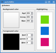
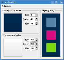
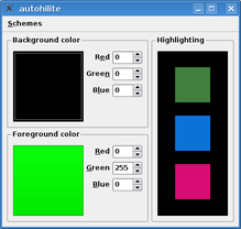
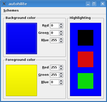
The screenshots on the following page show the algorithm in action in our demoapplication. You can manually choose both the foreground and backgroundcolors used, or simply choose one of the predefined color schemes.Among them are the traditional white on black, found by default in thevast majority of systems, and color schemes for Solaris and CDE.
The number of generated colors is fixed to three, presented in the form ofcolored squares in the box to the right, which is itself filled with thechosen background color.
Clockwise from top-left: White on black, white on dark blue, yellow onblue and green on black.
By playing with the red, green and blue values of each color, you can see howthe algorithm generates new combinations of colors. Try to avoid choosingforeground and background colors that are too close to each other; ourtechnique works best if these colors are visually distinct.
Since we provide a simple, self-contained function to perform the work ofgenerating these colors, we can easily adapt it for use in any application thatuses syntax highlighting.
[–њ—А–∞–≤–Є—В—М] Use Cases
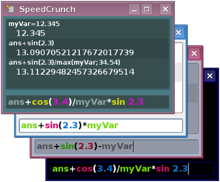
This automatic coloring for syntax highlighting idea came up during thedevelopment of the cross-platform Qt 4-based calculator SpeedCrunch(http://speedcrunch.org). It offershighlighting for variables, functions and numbers within its supportedmathematical expressions.
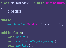
We can also apply the technique to Qt's Syntax Highlighter example.However, because it was not designed to be extensible, some changes arerequired. The version accompanying this article includes a dialog, availablevia the Settings menu, that lets the user generate a new color schemefor a given pair of foreground and background colors.
Although the algorithm generates reasonably distinct colors for a good pairof starting colors, we also let the user modify each of the generated colorsusing standard color selection dialogs.
A more sophisticated interface could be developed that lets users choosefrom a suggested palette of colors, adapting the choice as the user picksout each color to use for a highlighting style.
Alternatively, we could define a set of color schemes or themes to satisfythe majority of users, and provide a separate user interface to enable usersto configure them, perhaps with the aim of making themes usable across arange of applications.
[–њ—А–∞–≤–Є—В—М] Plan B and Other Improvements
Although our approach is intended to help the user obtain a nice set ofcontrasting colors, applications should always provide a "Plan B" mechanismto bypass or override algorithms like this that aim to be perfect. Partly,this is down to user choice—all human brains are different and there willalways be users who want to do it their own way—but also because some usershave special needs that our algorithm does not take into account.
However, because we want computers to work for us, not the other way around,we can still use this approach to generate a decent starting set of colorsthat users can fine-tune as they wish, as we have done in the modifiedSyntax Highlighter example. In some situations, where only a limitednumber of colors are involved, or where they are used for purely decorativepurposes, fine-tuning may not be necessary.
As we noted earlier, similar techniques can also be applied to other issues inuser interface design, such as the problem of how to colorize generic iconsto suit the user's preferred desktop theme, and potentially even accessibilityissues that affect color blind and partially-sighted users.
The code for our examples is available from the Qt Quarterly Web site.
