Pixel-Perfect Mac + Plastique
–Ь–∞—В–µ—А–Є–∞–ї –Є–Ј Wiki.crossplatform.ru

| 
|
| Qt Quarterly | –Т—Л–њ—Г—Б–Ї 23 | –Ф–Њ–Ї—Г–Љ–µ–љ—В–∞—Ж–Є—П | |
by Jasmin Blanchette
Apple provide detailed specifications of how Mac OS X applicationsshould look and behave. One aspect of these specifications is thespacing that should be used between widgets on a form. Foraesthetic reasons, Apple requires different values to be used fordifferent widgets. Starting with Qt 4.3, the layout and style systemstalk together to take this into account, rather than using amiddle-of-the-road value. The result? Dialogs that look perfect onthe Mac. Having just seen the light, we rushed to try out the samewith Plastique, the default X11 style.
–°–Њ–і–µ—А–ґ–∞–љ–Є–µ |
The Aqua Guidelines
One of Mac OS X's most noticeable improvements over previous versionsof the operating system is the introduction of a new look and feel,dubbed Aqua. The Aqua look takes advantage of the Mac graphicshardware, using semi-transparency and non-linear transformations toprovide smooth visual effects. Built-in components of Mac OS X suchas the Dock and the window frames, applications like Finder andSafari, and low-level libraries such as Cocoa and Carbon allcontribute to defining the Aqua look.
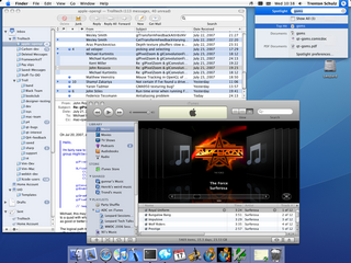
Figure 1. A Mac OS X 10.5 desktop featuring Aqua
Mac developers who use Cocoa or Carbon directly get Aqua-themedwidgets for free. The same is true of Qt developers: QMacStyle,the class that draws widgets on the Mac, uses the HIThemes API, justas Carbon itself does, ensuring that QPushButton, QScrollBar,and all their friends look native on the Mac.
However, parts of what makes an application look "Aqua" needs to behandled by the programmer. The Apple Human Interface Guidelines,sometimes called the "Aqua guidelines", is a freely available documentintended for "anyone building applications for Mac OS X",to ensure that their applications will blend in well with other Macapplications.
One of the aspects that falls under the guidelines is the sizeof graphical components and the recommended spacing between thesecomponents. For example, the guidelines specify that normal-sizedpush buttons should be 68 ? 20 pixels and that the spacing betweenbuttons laid out horizontally or vertically should be 12 pixels.In contrast, there should be 8 pixels between vertically stackedcheckboxes, and 5 pixels between radio buttons.
Using Qt 4.2 or earlier, the only way to respect the inter-widgetspacing constraints was to lay out forms manually, either in QtDesigner or in code. QMacStyle reported correct size hints forwidgets, but the built-in layout managers ( QBoxLayout and QGridLayout) worked in terms of fixed-size margins and spacings.
![]()
Figure 2. Examples of Aqua pixel metrics
A similar issue arises with margins: Until Qt 4.3, the layout usedthe same margin on all four sides of a window, while the Aquaguidelines specify 14 pixels for the top margin and 20 pixels for theleft, right, and bottom margins.
While these constraints may seem arbitrary, most of them actuallymake sense. For example, the top margin is smaller than the otherthree margins to account for the visual impact of the title bar.Likewise, mutually exclusive radio buttons rightfully deserve to beshown more closely together than checkboxes controlling independentsettings.
| 
|
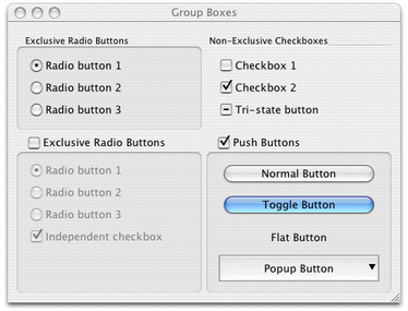
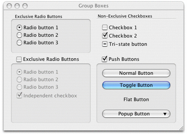
| Figure 3. Incorrect Aqua margins and spacings (Qt 4.2) | Figure 4. Correct Aqua margins and spacings (Qt 4.3) |
Figures 3 and 4 show the same dialog taken with Qt 4.2 and Qt 4.3. Inthe Qt 4.2 version, which uses 11 pixels for the margin and 6 pixelsfor the spacing, the dialog's top margin is too large, and the left,right, and bottom margins are too small.There is also a bit too much space between radio buttons, checkboxes,and push buttons, but, at the same time, too little space between thebottom two group boxes. (If you look closely at Figure 3, you mightnotice that the effective spacing of the push buttons is much morethan 6 pixels; this is because QPushButton has a margin ontowhich it normally doesn't draw.)
In contrast, the Qt 4.3 version version of the dialog follows theAqua guidelines. The result is much more visually appealing, andintegrates nicely with other Mac OS X applications.
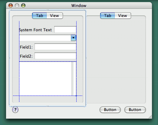
Figure 5. Apple's Interface Builder in action
Mac developers who develop their applications directly on top ofCocoa or Carbon keep their sanity by using Interface Builder, a GUIdesign tool provided by Apple. While Interface Builder falls short ofoffering a high-level layout system, it displays visual hints, or"guide lines", making it easy to line up widgets and to useappropriate margins and spacings around and between them.
Variable Margins and Spacings
To obtain correct margins and spacings with Qt, all that is necessaryis to recompile our existing applications against Qt/Mac 4.3. Themargins and spacings are transparently handled by Qt's layout andstyle systems. More precisely, QBoxLayout and QGridLayout nowquery the active QStyle to obtain proper margins and spacings,based on the widgets that are in the layout—and QMacStyle nowprovides that information.
Unsurprisingly, many changes were necessary in Qt to make thishappen. First, the old QLayout::setMargin(int) function had to begeneralized to take four arguments. The new function is calledsetContentsMargins(), because its signature and semantics followthat of QWidget::setContentsMargins(). Like before, the defaultvalues come from the currently active style; for QMacStyle, thedefault values are 20, 14, 20, 20.
To provide different spacings between different types of widgets, wehad to extend QSizePolicy so that it reports a ControlType.By default, QPushButton reports PushButton, and QScrollBar reports Slider, and so on. The layout managersquery these values and pass these on to the style. To obtain thehorizontal space between two QCheckBoxes, the layout managerwould call
    int spacing = style->layoutSpacing(QSizePolicy::CheckBox,
                                       QSizePolicy::CheckBox,
                                       Qt::Horizontal);
Figure 6 lists the different spacings used by QMacStyle inQt 4.3. The values were based partly on the Aqua guidelines, partlyon Interface Builder (whose values often contradict the Aquaguidelines), and partly on common sense.
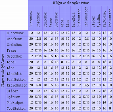
Figure 6. Spacings used by the Mac style in Qt 4.3
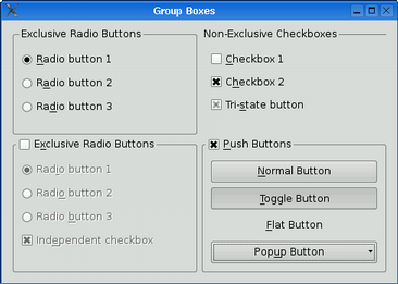
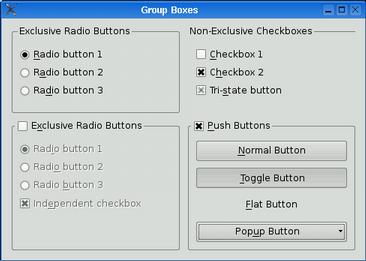
With this mechanism in place, we decided to also provide variablespacings in QPlastiqueStyle, the fallback style on X11. Figures 7and 8 below show the same dialog taken with Qt 4.2 and Qt 4.3, usingPlastique style.
| 
|
| Figure 7. Fixed-size spacings with Plastique (Qt 4.2) | Figure 8. Variable spacings with Plastique (Qt 4.3) |
To obtain the Qt 4.2 behavior, we can call setSpacing(6) on thelayout to specify a fixed spacing.
The Layout Item Rectangle
Child widgets cannot draw outside their geometries. Historically,this was necessary because the window system did not allow this, butin more recent versions of Qt this is preserved mainly for historicalreasons.
So why would a widget want to draw outside of the rectangle (0, 0,width() - 1, height() - 1)? The main reason is todraw a focus rectangle, a shadow, or some protruding elements. Whenwe put a widget in a layout, we would like these elements to overlapthe margin around the widget.
In the Graphics View framework, QGraphicsItem has a clippingrectangle, boundingRect(), that defines the area into which itmay draw, and an arbitrary non-rectangular geometry, shape(),that is used for mouse hit tests. Focus rectangles, shadows, and draghandles can be drawn outside the geometry defined by shape() byspecifying a suitably large boundingRect().
Ideally, QWidget would work like QGraphicsItem: It would beequipped with a boundingRect(), which could be different thanrect(). However, this change would affect lots of existing codein Qt and in applications, so it was rejected for Qt 4.3.
Instead, we decided to keep the equation "geometry == clippingrectangle" in place and to introduce an implicit "layout itemrectangle", which specifies the actual geometry of the item,excluding any shadow or other extra. This rectangle is defined bythe active style (as SE_CheckBoxLayoutItem,SE_ComboBoxLayoutItem, etc.) and queried by the built-in layoutmanagers. (To opt out, we can set the Qt::WA_LayoutUsesWidgetRectattribute on a widget.)
For all styles except QMacStyle, the layout item rectangle of awidget is always (0, 0, width() - 1, height() - 1).For Mac, the appropriate values were derived from Interface Builder,which has a mode where it shows the layout item rectangles as redboxes, as shown in Figure 9.
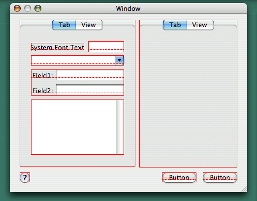
Figure 9. Layout item rectangles in Interface Builder
In addition to layout item rectangles, Interface Builder also showsthe baselines of widgets that display one line of text (such aslabels, line editors, and push buttons). When laying out widgets sideby side, the baselines should be aligned. Qt 4.3 doesn't provideexplicit support for this, but we hope to address this in future Qtversions.
Other Visual Improvements for Mac OS X
Qt 4.3 brings some other good news to Qt/Mac developers---andultimately to Mac end-users: Support for Mac-style "unifiedtoolbars" has been added as an option to QMainWindow, theMac-compliant Wizard Qt Solution has now migrated into Qt as QWizard, and the application icon can be made to bounce in thedock by calling QApplication::alert().

Figure 10. Mac-style unified toolbar
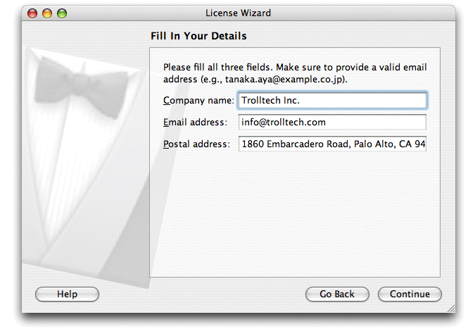
Figure 11. Wizard ("assistant")
These additons come on top of the Qt 4.2 improvements: Theintroduction of QDialogButtonBox, which reorders dialog buttonson the Mac, and the redesign of QMessageBox. These features werementioned in the article Reordering OK and Cancel in QtQuarterly issue 19.

Figure 12. Message box ("alert")
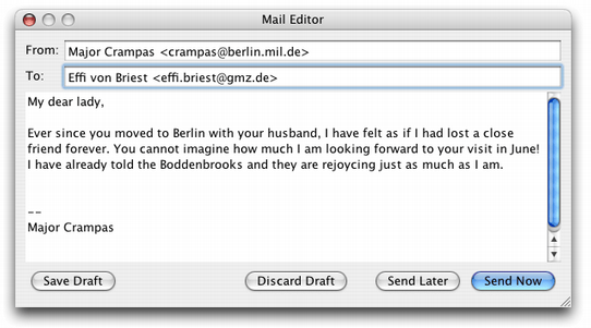
Figure 13. Dialog using button box
Conclusion
Qt's philosophy is that the toolkit should insulate the developerfrom the underlying platform. Whereas hard-core Mac developers whouse Carbon or Cocoa must respect various pixel guidelines whendesigning dialogs (the Interface Builder "guide lines" sure helpwhen they don't contradict the Aqua guidelines), Qt's layout andstyle systems take care of everything behind the scenes.
The current work is one step towards making Qt's layout managers andstyles look better, on Mac OS X and elsewhere. In future releases, wehope to provide better support for baseline alignment in layoutsand for high-resolution displays.
