Designing Delegates
–Ь–∞—В–µ—А–Є–∞–ї –Є–Ј Wiki.crossplatform.ru

| 
|
| Qt Quarterly | –Т—Л–њ—Г—Б–Ї 24 | –Ф–Њ–Ї—Г–Љ–µ–љ—В–∞—Ж–Є—П | |
–Э–∞–њ–Є—Б–∞–ї Johan Thelin.
–Ю–і–љ–Њ–є –Є–Ј –љ–∞–Є–±–Њ–ї–µ–µ –Є–љ—В–µ—А–µ—Б–љ—Л—Е –Њ—Б–Њ–±–µ–љ–љ–Њ—Б—В–µ–є Qt 4 —П–≤–ї—П–µ—В—Б—П —Б—В—А—Г–Ї—В—Г—А–∞ –Љ–Њ–і–µ–ї—М/–њ—А–µ–і—Б—В–∞–≤–ї–µ–љ–Є–µ. –Ю–љ–∞ –Њ–±–µ—Б–њ–µ—З–Є–≤–∞–µ—В —А–∞–Ј—А–∞–±–Њ—В—З–Є–Ї–∞ –±–Њ–ї—М—И–Њ–є –≥–Є–±–Ї–Њ—Б—В—М –њ—А–Є —А–∞–±–Њ—В–µ —Б —Н–ї–µ–Љ–µ–љ—В–∞–Љ–Є –Њ—В–Њ–±—А–∞–ґ–µ–љ–Є—П —Б–њ–Є—Б–Ї–Њ–≤, —В–∞–±–ї–Є—Ж –Є –і–µ—А–µ–≤—М–µ–≤. –•–Њ—В—П –≤–Њ–Ј–Љ–Њ–ґ–љ–Њ —Б–Њ–Ј–і–∞–љ–Є–µ –Њ—Б–Њ–±—Л–Љ –Њ–±—А–∞–Ј–Њ–Љ –њ–Њ–ї—М–Ј–Њ–≤–∞—В–µ–ї—М—Б–Ї–Є—Е –њ—А–µ–і—Б—В–∞–≤–ї–µ–љ–Є–є –Є –Љ–Њ–і–µ–ї–µ–є –і–ї—П –њ—А–µ–і—Б—В–∞–≤–ї–µ–љ–Є—П –і–∞–љ–љ—Л—Е, –≤ —Н—В–Њ–є —Б—В–∞—В—М–µ —Г–і–µ–ї–µ–љ–Њ –≤–љ–Є–Љ–∞–љ–Є–µ –±–Њ–ї–µ–µ —Г–і–Њ–±–љ–Њ–Љ—Г –њ–Њ–і—Е–Њ–і—Г, –Є—Б–њ–Њ–ї—М–Ј–Њ–≤–љ–Є—О –њ–Њ–ї—М–Ј–Њ–≤–∞—В–µ–ї—М—Б–Ї–Є—Е –і–µ–ї–µ–≥–∞—В–Њ–≤.
–°–Њ–і–µ—А–ґ–∞–љ–Є–µ |
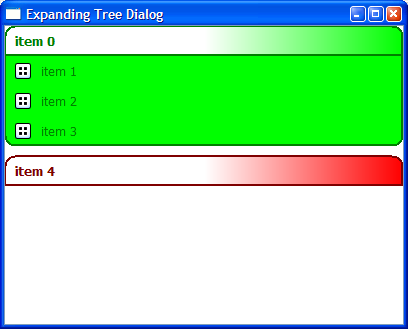
When looking at modern user interfaces, it is common to notice expanding lists. In the Windows world, we usually find task boxes to the left in the File Explorer as well as the list for removing installed programs in the Control Panel. You can shrink the boxes in the Explorer by clicking the titles, while items in the Control Panel list are automatically expanded as they are selected.
These widgets are often described as lists because that is how the user experiences them. However, when discussing the problem with Host Mobility in Gothenburg, I realized that tree is a more appropriate term for them. Looking at what actually takes place—an item is expanded to reveal more items—this makes perfect sense, and provides the basis for an implementation.
The reason for we rely on a tree instead of simply implementing a resizable delegate is due to the model/view architecture of Qt. Delegates have no means of telling the view that their sizes have changed when their states change. Such a method would mean that each view would have to query all its items, including those not shown, for their size; this would reduce many of the advantages of using the model/view approach.
[–њ—А–∞–≤–Є—В—М] An Expanding Tree
–Ш—В–∞–Ї, –љ–∞—И–∞ —Ж–µ–ї—М - —Б–Њ–Ј–і–∞–љ–Є–µ —Н–ї–µ–Љ–µ–љ—В–∞ –Ј–∞–≥–Њ–ї–Њ–≤–Ї–∞, –њ–Њ –Ї–Њ—В–Њ—А–Њ–Љ—Г –Љ–Њ–ґ–љ–Њ —Й–µ–ї–Ї–љ—Г—В—М. –Ъ–Њ–≥–і–∞ –њ–Њ –љ–µ–Љ—Г —Й–µ–ї–Ї–∞–µ–Љ, –Њ–љ —А–∞—Б–Ї—А–Њ–µ—В—Б—П, –і–ї—П —В–Њ–≥–Њ —З—В–Њ–±—Л –њ–Њ–Ї–∞–Ј–∞—В—М –љ–∞–±–Њ—А –њ–Њ–і—Н–ї–µ–Љ–µ–љ—В–Њ–≤. –Ъ–Њ–≥–і–∞ –њ–Њ –љ–Є–Љ —Й–µ–ї–Ї–∞–µ–Љ, —Н—В–Є —Н–ї–µ–Љ–µ–љ—В—Л –Љ–Њ–≥—Г—В –≤—Л–≤–Њ–і–Є—В—М –Є–љ—Д–Њ—А–Љ–∞—Ж–Є—О –Є–ї–Є –≤—Л–њ–Њ–ї–љ—П—В—М –і–µ–є—Б—В–≤–Є–µ. –Э–∞–Ї–Њ–љ–µ—Ж, –≥—А—Г–њ–њ–Є—А—Г—П —Н—В–Є —Н–ї–µ–Љ–µ–љ—В—Л –≤ –ї–Њ–≥–Є—З–µ—Б–Ї–Њ–є –њ–Њ—Б–ї–µ–і–Њ–≤–∞—В–µ–ї—М–љ–Њ—Б—В–Є, –Љ—Л –±—Г–і–µ–Љ —Г—З–Є—В—Л–≤–∞—В—М –њ—Г—Б—В—Л–µ –њ—А–Њ—Б—В—А–∞–љ—Б—В–≤–∞ (whitespace) (–Є–ї–Є –њ—А–Њ–±–µ–ї—Л) –≤ –і–µ—А–µ–≤–µ.
–Ь—Л –Є—Б–њ–Њ–ї—М–Ј—Г–µ–Љ –і–≤–∞ –Ї–ї–∞—Б—Б–∞: –і–µ–ї–µ–≥–∞—В (delegate) –і–ї—П –Њ–±–µ—Б–њ–µ—З–µ–љ–Є—П –≤–Є–Ј—Г–∞–ї–Є–Ј–∞—Ж–Є–Є –Є –њ–Њ–Љ–Њ—Й–љ–Є–Ї (helper) –і–ї—П –Њ–±–µ—Б–њ–µ—З–µ–љ–Є—П —Д—Г–љ–Ї—Ж–Є–Њ–љ–∞–ї—М–љ–Њ—Б—В–Є. –Ф–Њ —Н—В–Њ–≥–Њ, –љ–∞–Љ –љ–µ–Њ–±—Е–Њ–і–Є–Љ–Њ —Б–Њ–Ј–і–∞—В—М QTreeView –Є –њ–Њ–і–≥–Њ—В–Њ–≤–Є—В—М –і–ї—П –љ–µ–≥–Њ –Љ–Њ–і–µ–ї—М. –Ч–і–µ—Б—М –Є—Б—Е–Њ–і–љ—Л–є –Ї–Њ–і –њ–Њ–Ї–∞–Ј—Л–≤–∞–µ—В –Ї–∞–Ї –Ј–∞–њ–Њ–ї–љ—П–µ—В—Б—П –≥—А—Г–њ–њ–∞ —Н–ї–µ–Љ–µ–љ—В–Њ–≤.
    void TreeDialog::populateTree()
    {
      QStandardItemModel *model = new QStandardItemModel();
      QStandardItem *parentItem = model->invisibleRootItem();

      for (int i = 0; i < 4; ++i) {
        QStandardItem *item = new QStandardItem(
                       QString("item %0").arg(i));
        parentItem->appendRow(item);
        if (i == 0)
          parentItem = item;
        else {
          item->setData(
            QImage(":/trolltech/styles/commonstyle/"
                   "images/viewlist-16.png"),
            Qt::DecorationRole);
        }
        item->setData(QColor(Qt::green),
                      Qt::BackgroundColorRole);
        item->setData(ExpHelper::Item, ExpHelper::TypeRole);
        item->setData(i, ExpHelper::SignalValueRole);
      }
      ...
–Т—Б—П –Љ–Њ–і–µ–ї—М –Њ—Б–љ–Њ–≤—Л–≤–∞–µ—В—Б—П –љ–∞ QStandardItemModel. –Ю–љ–∞ –њ–Њ–Ј–≤–Њ–ї—П–µ—В –љ–∞–Љ –Ј–∞–њ–Њ–ї–љ–Є—В—М –Љ–Њ–і–µ–ї—М –Є —Г—Б—В–∞–љ–Њ–≤–Є—В—М —А–∞–Ј–ї–Є—З–љ—Л–µ —А–Њ–ї–Є –і–∞–љ–љ—Л—Е –і–ї—П –Ї–∞–ґ–і–Њ–≥–Њ —Н–ї–µ–Љ–µ–љ—В–∞. –Я–Њ—Б–Ї–Њ–ї—М–Ї—Г –≥—А—Г–њ–њ–∞ –њ–Њ–Ї–∞–Ј–∞–љ–∞ –љ–∞ –≤–µ—А—Е–љ–µ–Љ —Г—А–Њ–≤–љ–µ, —А–Њ–і–Є—В–µ–ї—М –њ–µ—А–≤–Њ–≥–Њ —Н–ї–µ–Љ–µ–љ—В–∞ –≤ –Љ–Њ–і–µ–ї–µ - invisibleRootItem. –Ю—Б—В–∞–ї—М–љ—Л–µ —Н–ї–µ–Љ–µ–љ—В—Л –≤ –і–µ—А–µ–≤–µ —П–≤–ї—П—О—В—Б—П –µ–≥–Њ –і–µ—В—М–Љ–Є.
–Ъ–∞–ґ–і–Њ–Љ—Г —Н–ї–µ–Љ–µ–љ—В—Г –≤ –Ї–Њ–љ—Б—В—А—Г–Ї—В–Њ—А–µ QStandardItem() –љ–∞–Ј–љ–∞—З–∞–µ—В—Б—П DisplayItem. –Ч–∞—В–µ–Љ —Г—Б—В–∞–љ–∞–≤–ї–Є–≤–∞—О—В—Б—П DecorationRole –Є BackgroundColorRole, –Є –і–∞–ї–µ–µ —Б–ї–µ–і—Г—О—В –њ–Њ–ї—М–Ј–Њ–≤–∞—В–µ–ї—М—Б–Ї–Є–µ TypeRole –Є SignalValueRole. –Я–Њ–Ј–і–љ–µ–µ –і–≤–µ —А–Њ–ї–Є –њ—А–Є–і—Г—В –Є–Ј –љ–∞—И–µ–≥–Њ –Ї–ї–∞—Б—Б–∞ –њ–Њ–Љ–Њ—Й–љ–Є–Ї–∞, ExpHelper.
[–њ—А–∞–≤–Є—В—М] –Ъ–ї–∞—Б—Б –Я–Њ–Љ–Њ—Й–љ–Є–Ї
TypeRole –Љ–Њ–ґ–µ—В –њ—А–Є–љ–Є–Љ–∞—В—М –Ј–љ–∞—З–µ–љ–Є–µ –ї–Є–±–Њ Spacer, –ї–Є–±–Њ Item. –Ъ–∞–ґ–і–Њ–µ –Є–Ј –љ–Є—Е –±—Г–і–µ—В –Њ–±—А–∞–±–∞—В—Л–≤–∞—В—М—Б—П –љ–∞—И–Є–Љ –і–µ–ї–µ–≥–∞—В–Њ–Љ. SignalValueRole –њ–Њ–Ј–≤–Њ–ї—П–µ—В –љ–∞–Љ —Г—Б—В–∞–љ–Њ–≤–Є—В—М –Ј–љ–∞—З–µ–љ–Є–µ, —Д–Њ—А–Љ–Є—А—Г–µ–Љ–Њ–µ —Б–Є–≥–љ–∞–ї–Њ–Љ, –Ї–Њ–≥–і–∞ –њ–Њ —Н–ї–µ–Љ–µ–љ—В—Г —Й–µ–ї–Ї–∞—О—В. –Ъ–∞–Ї –њ–Њ–Ї–∞–Ј–∞–љ–Њ –і–∞–ї–µ–µ, –Є —А–Њ–ї–Є, –Є —В–Є–њ—Л –Њ–њ—А–µ–і–µ–ї–µ–љ—Л –Ї–∞–Ї –њ–µ—А–µ—З–Є—Б–ї–µ–љ–Є—П (enumerations) –≤ ExpHelper.
    class ExpHelper : public QObject
    {
      Q_OBJECT

    public:
      ExpHelper(QTreeView *parent);
      enum ItemType{Spacer, Item};
      enum ItemRole{TypeRole = Qt::UserRole + 1000,
                    SignalValueRole = Qt::UserRole + 1001};
    signals:
      void itemClicked(int);

    private slots:
      void itemClicked(const QModelIndex &index);

    private:
      QPointer<QTreeView> viewPtr;
    };
–Ъ–ї–∞—Б—Б –њ–Њ–Љ–Њ—Й–љ–Є–Ї –њ—А–µ–і–љ–∞–Ј–љ–∞—З–µ–љ –і–ї—П —В–Њ–≥–Њ, —З—В–Њ–±—Л —Б–і–µ–ї–∞—В—М –њ–Њ–≤–µ–і–µ–љ–Є–µ –і–∞–љ–љ–Њ–≥–Њ QTreeView –њ–Њ–і–Њ–±–љ—Л–Љ —А–∞—Б–Ї—А—Л–≤–∞—О—Й–µ–Љ—Г—Б—П –і–µ—А–µ–≤—Г. –Ъ–Њ–љ—Б—В—А—Г–Ї—В–Њ—А –њ—А–Є–љ–Є–Љ–∞–µ—В QTreeView –Ї–∞–Ї —А–Њ–і–Є—В–µ–ї—П. –Ь—Л –Њ–њ—А–µ–і–µ–ї—П–µ–Љ –њ–µ—А–µ—З–Є—Б–ї–µ–љ–Є—П –і–ї—П —В–Є–њ–Њ–≤ –Є —А–Њ–ї–µ–є, –њ–Њ–і–Њ–±–љ–Њ —Б–Є–≥–љ–∞–ї—Г itemClicked(int). –Р—А–≥—Г–Љ–µ–љ—В integer, –њ–µ—А–µ–і–∞–≤–µ–Љ—Л–є –і–∞–љ–љ–Њ–Љ—Г —Б–Є–≥–љ–∞–ї—Г, —П–≤–ї—П–µ—В—Б—П –Ј–љ–∞—З–µ–љ–Є–µ–Љ –њ—А–Є–љ—П—В—Л–Љ SignalValueRole –≤–Њ –≤—А–µ–Љ—П —Б–Њ–Ј–і–∞–љ–Є—П —Н–ї–µ–Љ–µ–љ—В–∞. –Ч–∞–≤–µ—А—И–∞—О—Й–∞—П private —З–∞—Б—В—М –Ї–ї–∞—Б—Б–∞ –≤–Ї–ї—О—З–∞–µ—В —Б–ї–Њ—В, —Б–Њ–Њ—В–≤–µ—В—Б—В–≤—Г—О—Й–Є–є —Б–Є–≥–љ–∞–ї—Г itemClicked(int) –Є —Г–Ї–∞–Ј–∞—В–µ–ї—М –љ–∞ –њ—А–µ–і—Б—В–∞–≤–ї–µ–љ–Є–µ (view), –Ї–Њ—В–Њ—А–Њ–Љ—Г –њ–Њ–Љ–Њ—Й–љ–Є–Ї –њ—А–Є–љ–∞–і–ї–µ–ґ–Є—В. –Ф–ї—П —В–Њ–≥–Њ, —З—В–Њ–±—Л —Г–≤–Є–і–µ—В—М –Ї–∞–Ї –Њ–љ–Є –≤–њ–Є—Б—Л–≤–∞—О—В—Б—П –≤ –Ї–∞—А—В–Є–љ—Г, —А–∞—Б—Б–Љ–Њ—В—А–Є–Љ –Ї–Њ–љ—Б—В—А—Г–Ї—В–Њ—А:
    ExpHelper::ExpHelper(QTreeView *parent)
      : QObject(parent), viewPtr(parent)
    {
      if (!viewPtr)
        return;

      viewPtr->setIndentation(0);
      viewPtr->setRootIsDecorated(false);
      viewPtr->header()->hide();
      connect(viewPtr, SIGNAL(clicked(QModelIndex)), this,
              SLOT(itemClicked(QModelIndex)));
    }
The viewPtr is initialized from the parent; if the helper has no parent, we return from the constructor. Notice that the parent variable does not have a default value—that approach would not make sense because the helper relies on having a view to work with. We use a QPointer instead of a regular pointer because QPointer keeps track of the object being pointed to. If the view is deleted and the helper survives for some reason, the helper can easily detect that the view is gone. Given a view to work with, three things are done:
- The indentation property of the view is set to zero. This means that child items will not be indented, thus appearing right below their parent.
- The rootIsDecorated property is set to false to prevent any unwanted decorations from being shown.
- The header of the view is hidden.
The last thing that happens in the constructor is that the view's clicked( QModelIndex) signal is connected to the private itemClicked( QModelIndex) slot of the helper, shown here:
    void ExpHelper::itemClicked(const QModelIndex &index)
    {
      if (!viewPtr)
        return;

      if (index.parent().isValid()) {
        if (index.model()->data(index,
            SignalValueRole).isValid())
          emit itemClicked(index.model()->data(index,
                             SignalValueRole).toInt());
      } else {
        if (viewPtr->isExpanded(index))
          viewPtr->setExpanded(index, false);
        else {
          viewPtr->setExpanded(index, true);
          int childIndex = -1;
          while (index.child(childIndex+1, 0).isValid())
            childIndex++;

          if (childIndex != -1)
            viewPtr->scrollTo(index.child(childIndex, 0));
        }
      }
    }
The slot implementation is similar to the constructor—we return immediately unless we have a view to work with. The slot works in two different ways. If the clicked item has a parent and a valid SignalValueRole, the itemClicked(int) signal is emitted. If the item has no parent, its expanded state is toggled. When the item is expanded, the view shows the last of the children, ensuring that all items of the newly expanded group can be seen.
Let's have a look at the dialog using the helper. We have already looked at a part of the populateTree() member function of the TreeDialog class. Below you can see the where that method is called from the constructor.
    TreeDialog::TreeDialog(QWidget *parent) : QWidget(parent)
    {
      ui.setupUi(this);
      populateTree();
      ExpDelegate *delegate = new ExpDelegate(this);
      ui.treeView->setItemDelegate(delegate);
      ExpHelper *helper = new ExpHelper(ui.treeView);
      connect(helper, SIGNAL(itemClicked(int)), this,
              SLOT(itemClicked(int)));
    }
The TreeDialog class uses a dialog design created using Qt Designer. This design is first set up and the model populated before we start working with the tree view. We create and set up an item delegate and the helper. Finally the itemClicked(int) signal from the helper is connected to a slot of the same name in TreeDialog. The slot implements actions taken when a specific item is clicked.
Stepping back, we can see that the helper not only provides the functionality but also the appearance, in the form of a delegate.
[–њ—А–∞–≤–Є—В—М] The Appearance of a Delegate
A delegate can be used to visualize and provide editing capabilities for a model item. In this case, we use it to draw items and provide a size hint.
The class declaration of our delegate, ExpDelegate, is shown below. It consists of three parts: a constructor, the necessary methods and two private convenience methods.
    class ExpDelegate : public QAbstractItemDelegate
    {
      Q_OBJECT

    public:
      ExpDelegate(QObject *parent = 0);
      void paint(QPainter *painter,
                 const QStyleOptionViewItem &option,
                 const QModelIndex &index) const;
      QSize sizeHint(const QStyleOptionViewItem &option,
                     const QModelIndex &index) const;

    private:
      bool hasParent(const QModelIndex &index) const;
      bool isLast(const QModelIndex &index) const;
    };
The convenience methods come in handy when implementing all types of delegates. They provide the means to tell if a given item has a parent or if it is the last item among its siblings. This implementation, however simple, is shown next:
    bool ExpDelegate::hasParent(const QModelIndex &index)
      const
    {
      if (index.parent().isValid())
        return true;

      return false;
    }

    bool ExpDelegate::isLast(const QModelIndex &index) const
    {
      if (index.parent().isValid())
        if (!index.parent().child(index.row()+1,
            index.column()).isValid())
          return true;

      return false;
    }
The constructor of the delegate is empty—it only initializes the base class. The next interesting piece of code is found in the sizeHint() and paint functions. The sizeHint() function tells Spacer items apart from non-Spacer items. Spacers are used to divide items into groups and are small, while non-Spacer items are hinted to be 30 pixels high.
    QSize ExpDelegate::sizeHint(
      const QStyleOptionViewItem &option,
      const QModelIndex &index) const
    {
      if (index.model()->data(index, ExpHelper::TypeRole)
          == ExpHelper::Spacer)
        return QSize(10, 10);
      else
        return QSize(100, 30);
    }
The paint method divides the items into four groups: spacers, top items, middle items and bottom items. Looking back at the screenshot at the beginning of this article, you can easily tell them apart from the way that their backgrounds are drawn. This is done using the TypeRole and convenience methods.
    void ExpDelegate::paint(QPainter *painter,
      const QStyleOptionViewItem &option,
      const QModelIndex &index) const
    {
      if (index.model()->data(index, ExpHelper::TypeRole)
          == ExpHelper::Spacer) {
        // No need to draw spacer items
        return;
      }

      // Setup pens and colors

      if (!hasParent(index)) {
        // Paint the top-item
      } else if (isLast(index)) {
        // Paint the bottom item
      } else {
        // Paint middle items
      }

      // Draw common parts here (decoration and text)
    }
As the background is cleared to white before the paint method is called, we simply do nothing if a Spacer item is encountered. For the other types of items, the backgrounds are painted differently before the text and decoration are drawn by a common piece of code. These backgrounds are painted using a gradient brush and painter paths. Please refer to the downloadable source code that accompanies this article for the details.
[–њ—А–∞–≤–Є—В—М] Knowing Too Much
One drawback with the solution that we have so far is that the delegate cannot tell whether the item is expanded or not. This limitation exists because the same delegate can be used with multiple views at once, and the state may vary in different views. If we introduce a limitation that the delegate can only be used with one view at a time, the viewPtr solution from the helper class can be used here as well.
This is implemented in the AdvExpDelegate class, which is the ExpDelegate class with a few changes. Let's start by looking at the interesting lines of the class declaration.
    class AdvExpDelegate : public QAbstractItemDelegate

    {
      Q_OBJECT

    public:
      AdvExpDelegate(QTreeView *parent);
       ...

    private:
       ...
      bool isExpanded(const QModelIndex &index) const;
      QPointer<QTreeView> viewPtr;
    };
Firstly, we require the parent to be a QTreeView and there is no default parent value. Secondly, there is a private QPointer keeping track of the view used—this allows us to add the isExpanded() convenience method. The first implementation change is that the viewPtr is intialized by the constructor:
    AdvExpDelegate::AdvExpDelegate(QTreeView *parent) :
      QAbstractItemDelegate(parent), viewPtr(parent)
    {
    }
The isExpanded() method is implemented using the viewPtr:
    bool AdvExpDelegate::isExpanded(const QModelIndex &index)
      const
    {
      if (!viewPtr)
        return false;

      return viewPtr->isExpanded(index);
    }
The method is used in the paint() function for top-level items:
    void AdvExpDelegate::paint(QPainter *painter,
      const QStyleOptionViewItem &option,
      const QModelIndex &index) const
    {
      if (!viewPtr)
        return;

      if (index.model()->data(index, ExpHelper::TypeRole)
          == ExpHelper::Spacer ) {
        // No need to draw spacer items
        return;
      }

      // Setup pens and colors

      if (!hasParent(index)) {
        // Paint the top-item
        if (isExpanded(index)) {
            // Expanded
        } else {
            // Closed
        }
      } else if (isLast(index)) {
        // Paint the bottom item
      } else {
        // Paint middle items
      }

      // Draw common parts here (decoration and text)
    }
[–њ—А–∞–≤–Є—В—М] Making it Exclusive and Other Tricks
Now that I have shown you how to use the delegate, I would also like to show you a trick you can play with it. Just by adding the following two lines of code to the itemClicked( QModelIndex), before the current item is expanded, you can make sure that only one group of items is expanded at once.
      if (index.model()->data(index, TypeRole) != Spacer)
        viewPtr->collapseAll();
Note that if you call collapseAll() for a Spacer, you will make the items collapse. This could happen if the user misses an item and clicks on white space instead.
I'm sure that you can find numerous other tricks for both the delegate and the helper. For example, items that expand with a timer, expandable sub-items, and so on. Feel free to download the source code for this article and play around with the examples.


